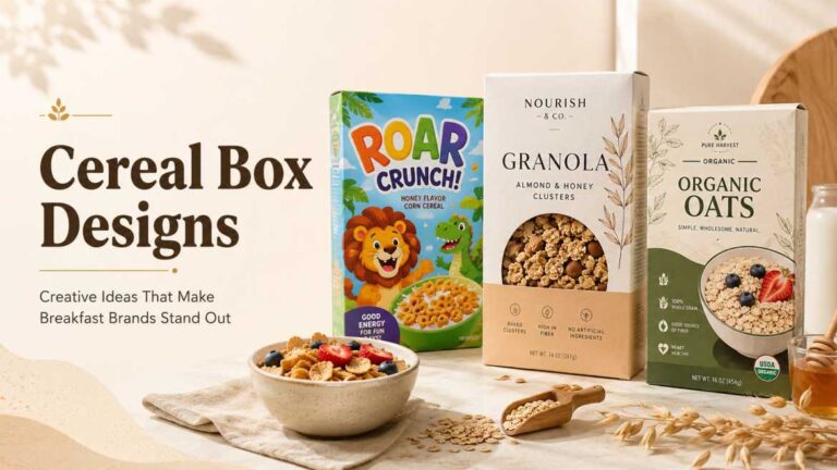
How to Design Your Own Cereal Box: A Simple Step-by-Step Guide
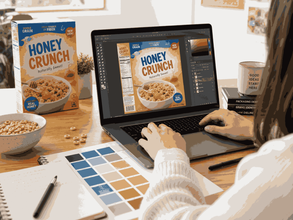
Learning how to design your own cereal box sounds like a small creative project at first. Pick a color, add a logo, write the cereal name… done, right?
Not really.
A cereal box is more than just a pretty container. It has to catch attention, explain the product, show the brand personality, and still look clean enough for someone to understand in a few seconds. Whether you’re making a custom cereal box for a school project, birthday party, small food brand, product mockup, or creative packaging idea, the process becomes much easier when you know what goes where.
So, let’s break it down in a simple way.
Why Learning How to Design Your Own Cereal Box Matters
Before you start creating your own box, it helps to understand the basic principles of cereal box design, such as layout, colors, typography, and product presentation.
Think about a supermarket shelf for a second. So many boxes. Bright colors, mascots, bold names, health claims, and product photos are all fighting for attention.
Your cereal box has only a few seconds to make someone stop and look. That’s why the design needs to do three things quickly:
- Tell people what the cereal is
- Make the product look tasty or interesting
- Build trust through clear information
And yes, design matters even if your box is just for a personal project. A good cereal box feels intentional. A messy one feels rushed.
Start With the Purpose of Your Cereal Box
Before opening Canva, Photoshop, Illustrator, or any box mockup tool, ask yourself one simple question:
Who is this cereal box for?
A kid’s cereal box will look different from a healthy granola box. A birthday party favor cereal box will look different from a real retail product. A luxury organic cereal box may need soft colors, clean fonts, and natural textures. But a fun chocolate cereal? That can be playful, bold, maybe even a little loud.
Here are a few common cereal box styles:
| Cereal Box Type | Best Design Style | Good For |
|---|---|---|
| Kids’ cereal | Bright colors, mascot, playful fonts | Fun breakfast brands, school projects |
| Healthy cereal | Clean layout, earthy colors, ingredient focus | Granola, oats, fitness cereal |
| Party favor box | Personalized name, photos, theme colors | Birthdays, baby showers, events |
| Premium cereal | Minimal design, strong typography | Organic or luxury-style packaging |
| Retro cereal | Vintage fonts, grainy texture, old-school colors | Creative branding projects |
Once the purpose is clear, half the confusion goes away.
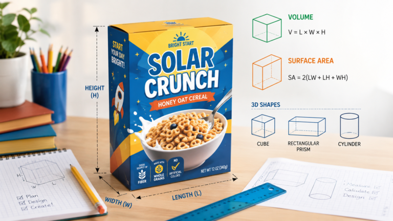
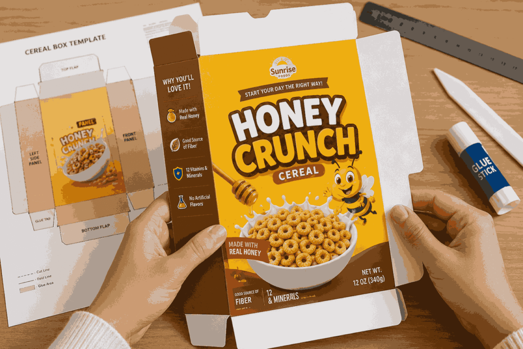
Choose the Right Cereal Box Size
If you’re working on a school assignment, the cereal box design project’s geometry part can also help you understand measurements, panels, area, and how the box folds into a 3D shape.
A standard cereal box usually has a tall rectangular shape. Many common cereal boxes are around 10 to 12 inches tall, but the exact size depends on how much cereal you want to pack. Mini boxes for party favors can be much smaller, while family-size boxes are taller and wider.
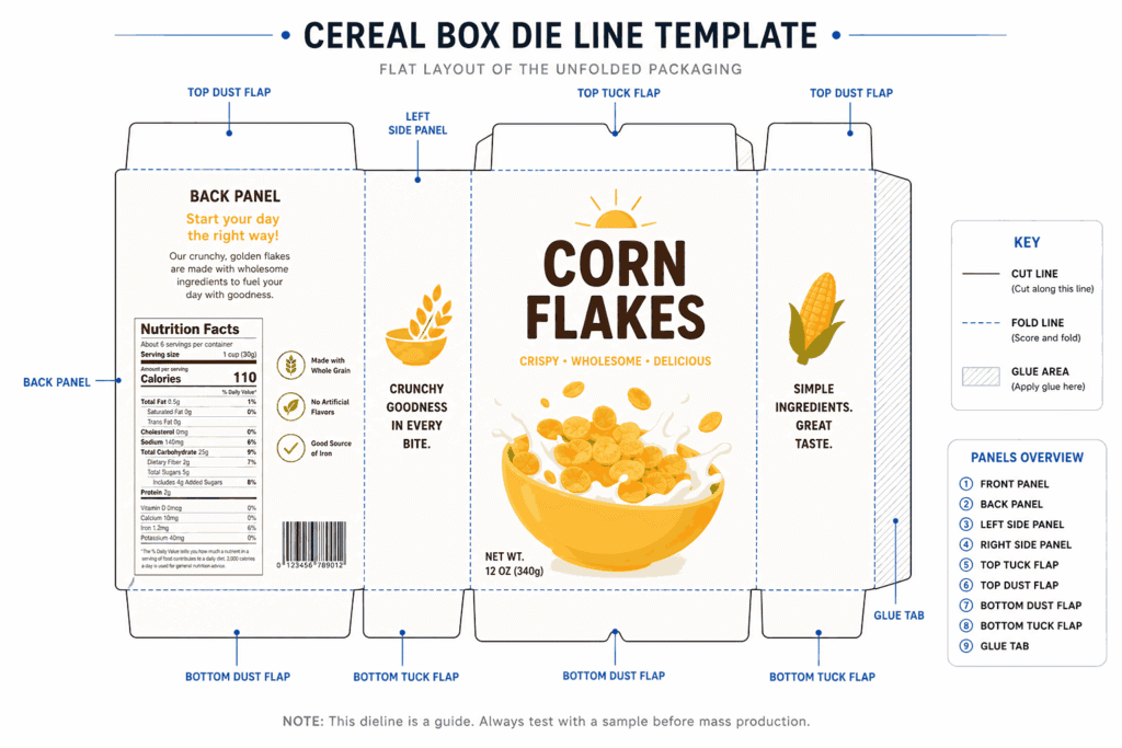
If you’re only making a digital design, you can use a template. If you’re printing it, don’t guess the size. Use a proper dieline or cereal box template with the following:
- Front panel
- Back panel
- Left side panel
- Right side panel
- Top flap
- Bottom flap
- Glue area
- Bleed area
- Fold lines
That sounds technical, but it’s not scary. A dieline is basically the flat version of your box before it gets folded. Like a map.
And please don’t put important text too close to the edges. When the box is cut or folded, tiny shifts can happen. Keep your logo, cereal name, and main image inside the safe area.
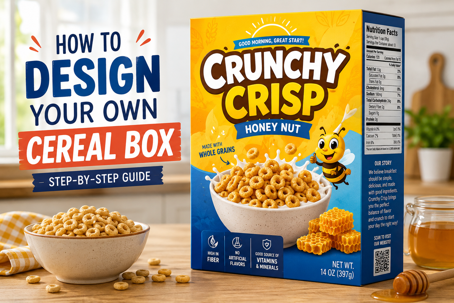
Design the Front Panel First
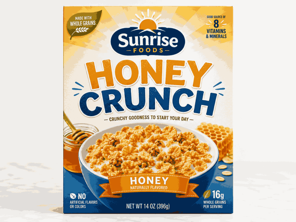
The front panel is the hero. This is what people see first, so don’t overload it.
A strong cereal box front usually includes the following:
- Brand name or logo
- Cereal name
- Main product image or illustration
- Flavor
- Short benefit or hook
- Net weight
- A clean background
For example, instead of writing too much like “Delicious crunchy honey-flavored oat cereal made with premium ingredients for every morning,” keep it short:
Honey Crunch Oats
Golden, crispy, and lightly sweet.
See? Easier to read.
Your front design should have one clear focal point. Maybe it’s a bowl of cereal. Maybe it’s a cartoon mascot. Maybe it’s big typography. But don’t make everything shout at the same time. If everything is bold, nothing feels bold.
Pick Colors That Match the Product
Colors speak before words do.
Chocolate cereal often works well with brown, cream, yellow, or red accents. Berry cereal can use pink, purple, blue, and fresh fruit tones. Healthy oats packaging usually looks better with beige, green, white, kraft paper, or muted colors.
A simple color formula:
- 1 main color
- 1 supporting color
- 1 accent color
- 1 neutral color for text/background
For example:
| Cereal Flavor | Color Idea |
|---|---|
| Chocolate | Brown, cream, red |
| Strawberry | Pink, white, green |
| Honey oat | Yellow, beige, brown |
| Blueberry | Blue, purple, cream |
| Organic granola | Kraft, olive green, white |
But don’t choose colors only because they look cute. Make sure the text is readable. Light yellow text on white background? Not good. Tiny white font on a busy cereal bowl photo? Also not good.
Use Fonts Carefully
Fonts can make your cereal box look professional… or very homemade.
For a cereal box, use two fonts max. Three if you really know what you’re doing.
A good setup:
- Bold display font for cereal name
- Simple, readable font for ingredients and small text
- Optional playful font for small callouts
Avoid using too many styles like shadow, outline, curved text, glow, and 3D effects altogether. It gets messy fast.
Also, keep your small text readable. Ingredients, nutrition, and side panel copy should not feel like a secret message.
Add Product Images or Illustrations
A cereal box without a product visual can feel empty. You can use:
- A cereal bowl photo
- Floating cereal pieces
- Fruit illustrations
- Milk splash effect
- Mascot character
- Ingredient icons
- Pattern background
If the cereal is real, show it honestly. If it’s a mockup or school project, you can be more creative, but still try to make it believable.
For a healthy cereal design, natural ingredient images work well: oats, almonds, honey, berries, and grains. For kids, a fun character or mascot can make the box more memorable.
And one small thing… leave breathing space. White space is not wasted space. It helps the design look clean.
Plan the Side Panels
Most beginners spend all their time on the front and forget the sides. But side panels are important.
One side can include nutrition facts, ingredients, allergens, barcode, storage instructions, and manufacturer details. The other side can be more brand-focused. You can add a short story, serving idea, QR code, fun game, or social media handle.
Side panel ideas:
- “Why you’ll love it”
- Quick breakfast recipe
- Brand story
- Kids puzzle or maze
- Sustainability message
- QR code to website
- Social media username
- Storage tip: “Store in a cool, dry place”
For real food packaging, you should be careful with claims. Don’t write “healthy,” “sugar-free,” “organic,” or “high protein” unless the product actually meets the rules in your market.
Create the Back Panel
The back panel gives you more room to connect with the customer.
For kids’ cereal, add a game, comic, maze, or character story. For adults, add a recipe, nutrition message, lifestyle photo, or brand story. For a premium cereal, you can keep it simple and elegant.
A good back panel structure can look like this:
- Short headline
- Brand story or product benefit
- Serving suggestion
- Icons for key features
- Website or QR code
- Small visual element
Example:
Start Your Morning With a Better Crunch
Made for busy mornings, slow Sundays, and everything in between. Enjoy it with cold milk, yogurt, or straight from the box. No judgment.
This type of copy feels friendly. Not too salesy.
Don’t Forget Required Packaging Details
If your cereal box is for a real product, design is not enough. You may need to include proper labeling information based on your country’s food packaging rules.
Common cereal box information includes:
- Product name
- Net weight
- Ingredients list
- Nutrition facts
- Allergen information
- Barcode
- Manufacturer or distributor details
- Expiry or best-before date
- Batch number
- Storage instructions
For personal use or party favors, you can use a decorative nutrition label. But for selling a real cereal product, don’t fake this information. Get it checked properly.
Make a Mockup Before Printing
Once your flat design is ready, place it on a 3D box mockup. This helps you see how the design looks when folded.
Check these things:
- Is the cereal name visible?
- Are the side panels aligned?
- Is the barcode placed correctly?
- Is any text too close to the folds?
- Does the front look attractive from a distance?
- Are colors too dark or too light?
- Does it look like one complete brand?
Sometimes a design looks perfect flat, but weird on a real box. Mockups save you from that.
Printing Tips for a Better Finish
If you’re printing at home, use thick paper or cardstock for small boxes. For professional packaging, paperboard is usually used because it is light, printable, and strong enough for dry cereal packaging.
Before final printing, export your file in high quality. Usually PDF print format works best. Use CMYK color mode if your printer asks for it. Add bleed if the design goes to the edge.
A few quick print tips:
- Use high-resolution images
- Keep text sharp and readable
- Avoid low-quality screenshots
- Print one sample before bulk printing
- Test folding before final approval
And yes, always proofread. A cereal box with a spelling mistake on the front is painful. Really painful.
Common Mistakes to Avoid
Here are the mistakes that make cereal box designs look weak:
- Too many fonts
- Low-quality images
- No clear focal point
- Text too close to the edge
- Colors that don’t match the flavor
- Overcrowded front panel
- Missing side panel information
- Fake or unclear nutrition details
- No mockup before printing
- Poor contrast between text and background
Simple is usually better. Clean, clear, and memorable.
Final Thoughts
Learning how to design your own cereal box is not just about making something pretty. It’s about creating packaging that feels useful, attractive, and easy to understand. Start with the purpose, choose the right template, design a strong front panel, organize the side and back panels, then test everything with a mockup.
Your first design may not be perfect. That’s fine. Packaging design improves with small changes — better spacing, stronger colors, cleaner typography, and more thoughtful details.
So start simple. Build the box step by step. And before you know it, your cereal box will look like something people would actually pick up from a shelf.