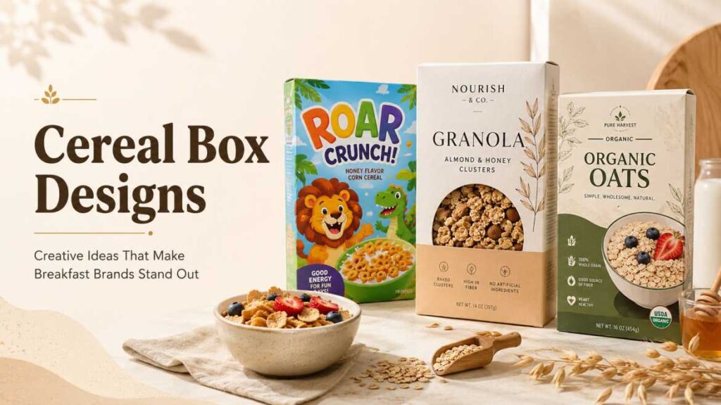
Cereal boxes are funny little things.
Most people see them every morning, half-awake, maybe while pouring milk too fast or looking for coffee. But for brands, a cereal box is not just a box. It’s a tiny billboard sitting on a crowded shelf, trying to say, “Pick me.” And that’s exactly why cereal box designs matter so much.
A good cereal box does more than hold flakes, oats, granola, or chocolate loops. It tells the buyer what the cereal is, who it’s for, how it tastes, and sometimes even what kind of lifestyle it belongs to. Healthy. Fun. Organic. Premium. Kid-friendly. High-protein. Budget-friendly. All of that can be shown before the customer even reads the ingredients.
Packaging design sources often highlight things like bold typography, strong colors, mascots, recyclable cardboard, and freshness-focused inner bags as common cereal packaging features. Many cereal brands also use the large front panel of a cardboard box for branding, characters, product photography, and nutritional claims.
So, if you’re planning a cereal brand, redesigning packaging, or just looking for inspiration, here are practical cereal box design ideas that feel modern, attractive, and actually useful.
Why Cereal Box Designs Are So Important
Think about a supermarket aisle for a second. There are so many boxes. Red ones, yellow ones, cartoon ones, clean white ones, big family packs, tiny healthy-looking packs. It’s noisy.
Your cereal box design has to work quickly.
People don’t spend ten minutes analyzing every cereal pack. Usually, they glance, compare, and choose. That means the front design must be clear and attractive within seconds.
A strong cereal box design can help with the following:
- Building brand recognition
- Showing product flavor clearly
- Attracting kids or adults, depending on the target audience
- Making the product look fresh and tasty
- Communicating nutrition benefits
- Standing out on retail shelves
- Creating trust through clean packaging information
And yes, design can make an ordinary cereal feel special. Sometimes the cereal inside is simple, but the box makes it feel premium.
Main Elements of a Good Cereal Box Design
A cereal box has many parts. The front panel gets the most attention, but the sides and back matter too.
Here’s a simple table to understand what each design element does:
| Design Element | Purpose | Best Practice |
|---|---|---|
| Logo | Builds brand identity | Keep it clear and easy to read |
| Color palette | Creates mood and shelf impact | Use colors based on audience and flavor |
| Typography | Shows personality | Bold for kids, clean for healthy brands |
| Product image | Builds appetite appeal | Use fresh, realistic food styling |
| Mascot or character | Makes box memorable | Best for children’s cereals |
| Nutrition highlights | Builds trust | Keep claims honest and simple |
| Back panel | Adds engagement | Use games, recipes, brand story, or serving ideas |
| Material | Protects product | Cardboard box with inner freshness bag is common |
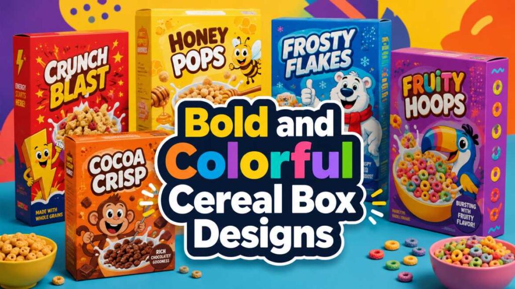
1. Bold and Colorful Cereal Box Designs
Bright colors are still one of the strongest ways to get attention.
For kids’ cereals, colors like red, yellow, orange, blue, and purple work well because they feel playful and energetic. These shades make the box look fun even from a distance. Add a cartoon character, big cereal bowl image, and some movement in the design — and suddenly the box feels exciting.
But here’s the thing. Bright doesn’t mean messy.
Too many colors can make the box look cheap or confusing. A better approach is to choose one main color, one supporting color, and one accent color. Simple, but still lively.
For example:
- Chocolate cereal: brown, cream, yellow
- Honey cereal: yellow, orange, white
- Berry cereal: pink, purple, cream
- Corn flakes: yellow, white, red
- Healthy oats: beige, green, soft brown
And if the brand is for kids, adding games or fun visuals on the back panel can make the box more interactive. Some packaging guides recommend playful pictures, cartoons, and games for children’s cereal boxes because they make breakfast feel more enjoyable.
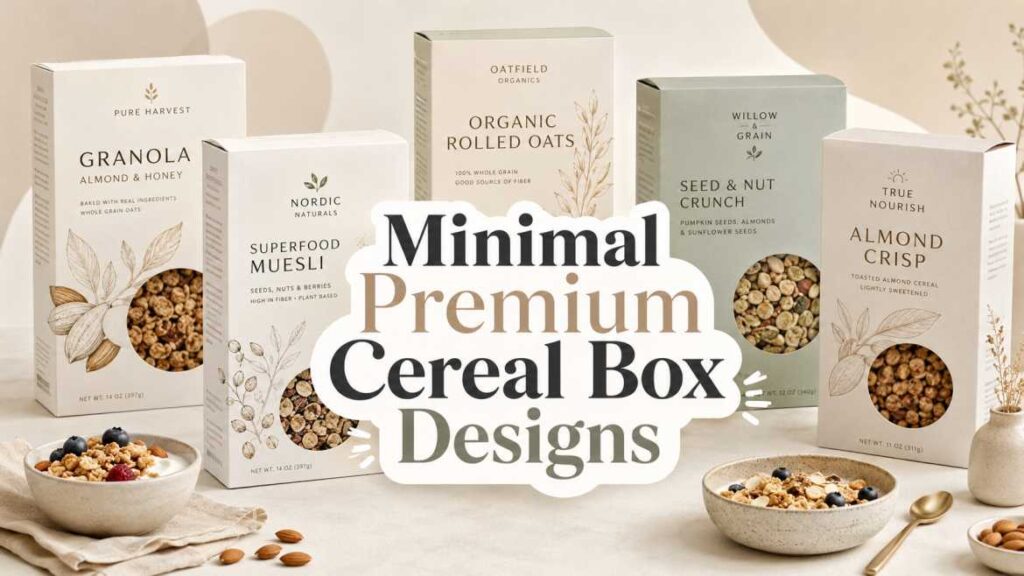
2. Minimal Cereal Box Designs for Premium Brands
Not every cereal box needs to shout.
Some brands look better when they stay calm. Minimal cereal box designs usually use clean typography, lots of white space, soft colors, and simple product images. This style works especially well for organic cereal, granola, muesli, protein cereal, and adult-focused breakfast products.
Minimal design gives a premium feeling. It says, “We don’t need to be loud. The product speaks for itself.”
Common features include:
- Simple logo placement
- Neutral background
- Clean ingredient icons
- Soft product photography
- Limited color palette
- Clear nutrition callouts
- Matte finish packaging
But don’t make it too empty. A cereal box still needs warmth. Add a bowl photo, grain texture, fruit illustration, or little spoon detail to make it feel more human.
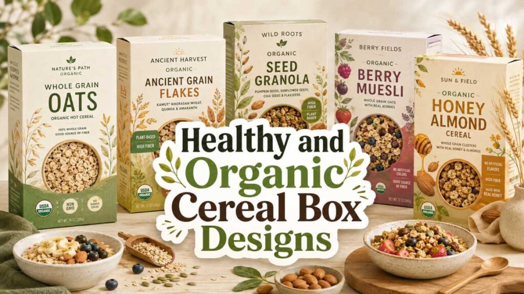
3. Healthy and Organic Cereal Box Designs
Healthy cereal packaging has a different job. It needs to look fresh, clean, and trustworthy.
People buying healthy cereal often check ingredients, sugar level, fiber, protein, whole grains, and whether the product feels natural. So the design should make that information easy to find.
Good ideas for healthy cereal box designs:
- Use earthy colors like green, beige, brown, cream, and soft yellow
- Add real ingredient visuals like oats, almonds, berries, seeds, or honey
- Keep the nutrition claims short and readable
- Use simple icons for “whole grain,” “high fiber,” or “no artificial colors.”
- Avoid too many cartoon-style graphics
- Make the ingredient list and nutrition panel clean
Front-of-package claims can influence how shoppers understand a product. Research has also shown that front labels, such as protein claims on cereal, can create a “health halo,” meaning people may see the product as healthier because of one highlighted claim. So brands should use nutrition messages carefully and honestly.
And honestly, that matters. A beautiful box is good, but misleading packaging can hurt trust.
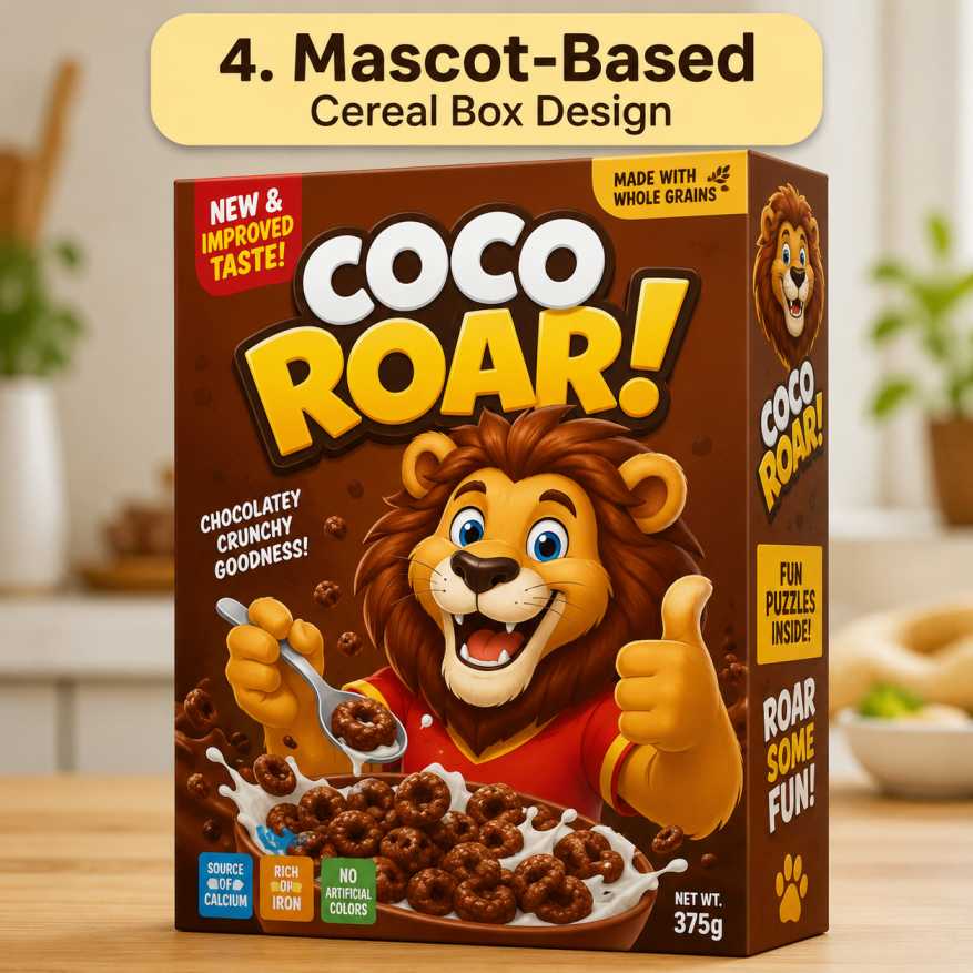
4. Mascot-Based Cereal Box Designs
A mascot can make a cereal box unforgettable.
For kids’ cereal, mascots are almost classic. A tiger, bear, rabbit, monster, robot, unicorn, little chef — whatever fits the brand story. The mascot gives the box a face. Kids remember faces better than plain logos.
A mascot can appear:
- On the front panel
- In small poses around the box
- On the back panel with games
- On social media campaigns
- In stickers, cards, or QR activities
- In limited-edition packaging
The trick is to make the mascot match the cereal flavor. A honey bear makes sense. A space robot might work for colorful rings. A farm-style character may fit organic corn cereal.
But don’t copy common cereal characters. Create something ownable. Something that can become part of the brand identity for years.
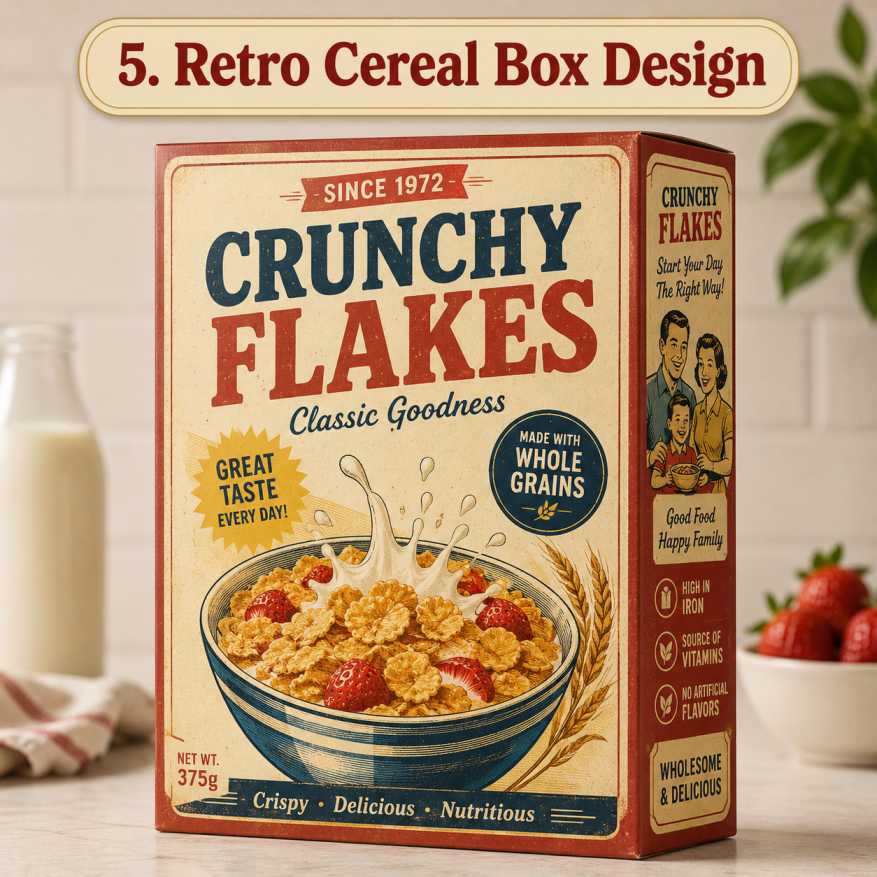
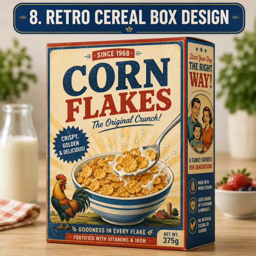
5. Retro Cereal Box Designs
Retro packaging is back in a big way.
Old-school fonts, vintage colors, grainy illustrations, simple badges, and classic breakfast bowl images can create nostalgia. Adults who grew up with cereal may feel attracted to packaging that reminds them of childhood mornings.
Retro cereal box designs work well for:
- Corn flakes
- Chocolate cereal
- Honey cereal
- Limited-edition products
- Family-size packs
- Artisan breakfast brands
Use colors like cream, faded red, mustard yellow, old blue, and warm brown. Add vintage-style labels like “classic crunch,” “family favorite,” or “since 1985” if it’s true. Don’t fake history, though. People notice.
Recent cereal campaigns also show that nostalgia can be powerful. General Mills, for example, created limited-edition cereal boxes with “Saved by the “Bell”-themed visuals, using colorful references from the TV show to attract attention and connect emotionally with shoppers.
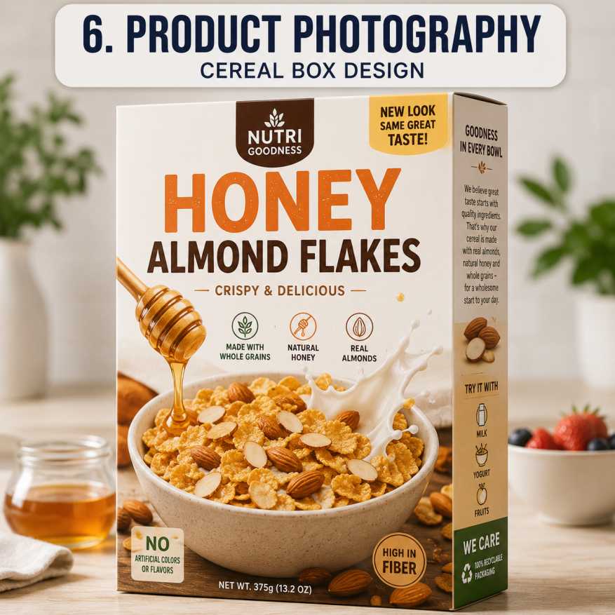
6. Cereal Box Designs With Strong Product Photography
A cereal box should make people hungry.
That’s where food photography helps. A bowl full of cereal, fresh milk splash, strawberries, bananas, chocolate pieces, honey drizzle, or almonds can instantly show taste and texture.
Good food images should look:
- Fresh
- Bright
- Clean
- Realistic
- Crunchy
- Appetizing
For cereal, the image should not look too fake. If the cereal is crunchy, show crunch. If it has berries, show berries. If it’s chocolate, show chocolate clearly.
The front image should answer one simple question: “What will this taste like?”
Because people buy with eyes first. Especially food.
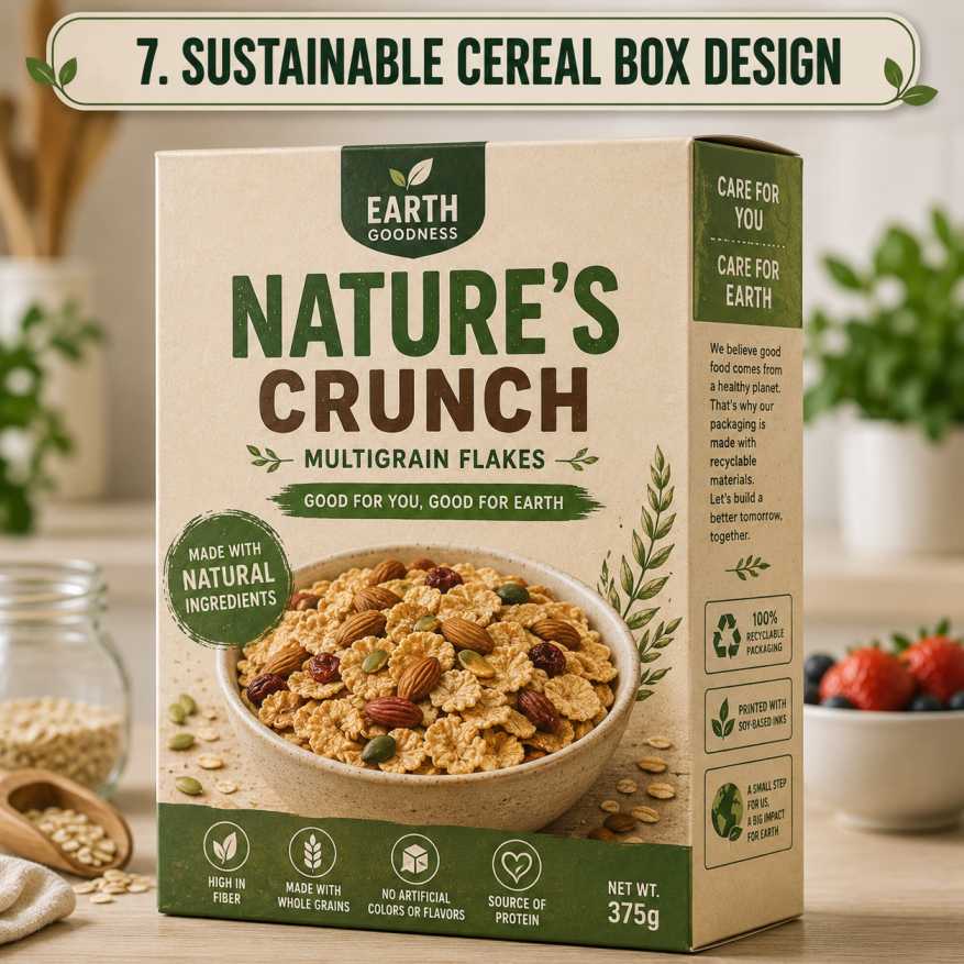
7. Sustainable Cereal Box Designs
Sustainability is becoming more important in packaging.
Many brands now highlight recyclable cardboard, reduced plastic use, soy-based inks, or eco-friendly packaging choices. Cereal boxes are often made with cardboard and an inner bag to protect freshness, and packaging guides mention recycled cardboard as an upgrade many brands consider.
For sustainable cereal box designs, use:
- Recyclable cardboard
- Simple kraft paper textures
- Soy or water-based ink messaging
- Minimal plastic where possible
- Clear recycling symbols
- Earthy color palettes
- Honest sustainability statements
Don’t overdo green claims. A small, clear message is better than a big fake-looking “eco” badge.
8. Back Panel Ideas for Cereal Boxes
The back of the cereal box is often underrated.
Kids read it. Parents read it. Some people stare at it while eating breakfast. So use it.
Back panel ideas:
- Fun puzzles
- Maze games
- Quick breakfast recipes
- Brand story
- Ingredient sourcing story
- QR code for activities
- Collectible cards
- Nutrition education
- Serving suggestions
- “Did you know?” facts
And for adult cereal brands, the back panel can be calmer—maybe a simple recipe for overnight oats, a brand mission, or a small note about ingredients.
Cereal Box Design Ideas by Audience
Different buyers need different design styles.
| Target Audience | Best Design Style | Colors to Use | Key Message |
|---|---|---|---|
| Kids | Playful, mascot-based | Bright red, blue, yellow, purple | Fun, taste, adventure |
| Parents | Balanced and clear | Soft brights with clean white space | Taste + nutrition |
| Fitness buyers | Minimal and bold | Black, white, green, blue | Protein, fiber, low sugar |
| Organic shoppers | Natural and earthy | Beige, green, brown, cream | Clean ingredients |
| Premium buyers | Elegant and simple | White, gold, navy, muted tones | Quality and taste |
| Budget buyers | Clear and direct | Red, yellow, white | Value and family size |
Common Mistakes in Cereal Box Designs
Some cereal boxes look bad, not because the idea is bad, but because too many things are fighting for attention.
Avoid these mistakes:
- Too many fonts on one box
- Tiny product name
- Overcrowded front panel
- Weak color contrast
- Poor-quality food image
- Nutrition claims that look confusing
- Mascot that doesn’t match the brand
- No clear flavor name
- Back panel left empty
- Design that looks too similar to competitors
A cereal box should feel easy to understand. That’s the whole point.
Final Thoughts
Good cereal box designs are not just pretty packaging. They’re part branding, part storytelling, part shelf strategy, and part customer trust.
A kids’ cereal box may need bright colors and a fun mascot. A healthy granola box may need earthy tones, clean typography, and ingredient-focused visuals. A premium cereal brand may need soft photography, simple design, and a matte finish.
But whatever style you choose, keep one thing clear: the cereal box must quickly show what the product is, who it’s for, and why someone should pick it up.
Because in the cereal aisle, people don’t have much time.
They look. They feel something. They choose.
And that small cardboard box? It does a lot more selling than we think.


Leave a Comment